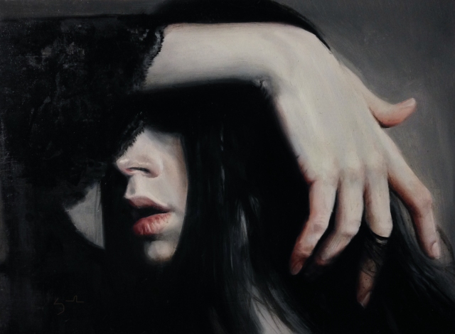
Jean Cauthen is back with her last “mini” art history lesson. We so appreciate Jean’s posts for their delightful insights, humor and intelligence. Will miss not having her art history posts but maybe we can convince her to share more with us on occasion.
Through A Handsome Salesman’s Eyes: Portrait of Emile Zola
Looking For love in all the Wrong Places
I once thought I found my soul-mate in a textbook salesman. This handsome fellow stood in my office doorway, chatting about all things art and textbook selection.
Our musings ranged from Frank Sinatra, Italy, Mardi Gras, Boz Scaggs (really? you’re a fan too???), Indian food, Fairfield Porter to tabasco sauce. It seemed our interests perfectly aligned!
I looked forward to every visit and maybe, just maybe, a life-time of free book samples.
Then one day, after a particularly lively conversation, I swiveled around and faced my cluttered bulletin board. It was all there. The art postcards, concert stubs, menus…laid out like a friggin’ road map.
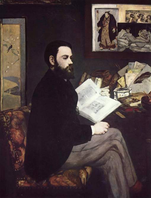
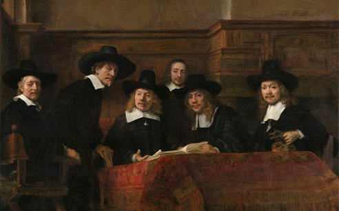
Don’t laugh. I am not the only one to lay it all out there on an office wall. Another to tell his story in public was Edouard Manet in his bulletin board biography of a painting, Portrait of Emile Zola.
So let’s play handsome salesman and decipher a cluttered desk and office supplies for clues into the artist, Edouard Manet and his new soul mate, the rising novelist and art critic, Emile Zola.
The thanks-for-having-my-back, Portrait.
Many painters were grateful to Emile Zola. The writer was a tireless defender of the often maligned Impressionists.
 Zola’s ideas on True Art challenged traditional Academy standards. Art, he stated, should bear the imprint of its creator, be original and not cave to dictates of society. In short. Art should be a Manet.
And Zola said so in a skinny little blue book called “In Defense of Manet.”
Manet’s portrait of Zola is a thank-you note to the sitter for this defense. In the painting, the book is tucked behind an East Asian ink well and quill (symbolizing the sitter’s occupation) and serves as the artist’s signature.

Stopping work to chat with a salesperson.
Now let’s be honest.
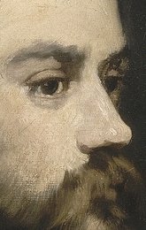
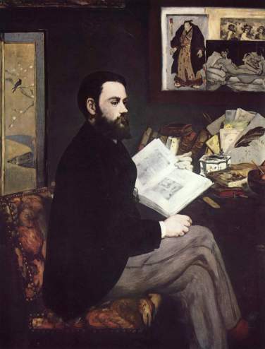
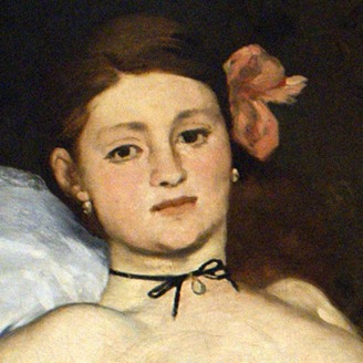
As portraits go, this doesn’t exactly put the 26-year-old Zola in the best light. Odilon Redon (1840- 1916) observed “(This portrait) is rather a still life, so to speak, than the expression of a human being”.
Here, the writer and political activist is shown at his work table. He is thumbing through an Art book (perhaps a comely text book representative just visited?), when his blank-stare gaze has locked onto something beyond his desk.
It is a similar stare that caused the ruckus that cemented team Zola/Manet.
Whadda YOU looking at?
The reason anyone would have to defend Manet and his painting, “Olympia” has to do with the fierce scandal the painting produced. The subject (a prostitute), the spatial treatment, and the impudent ‘stare’ of the 16-year-old courtesan toppled a top hat or two while on view at the 1865 Salon.
The French, though well accustomed to gazing upon nude women in Art, weren’t ready for the nudes to stare back.
Checking bags for spray-paint
 NO. REALLY. Two full-time guards were hired to prevent the spitting upon or other degradation committed to this painting.
“Before anyone knew what was happening,” writes art critic Eunice Lipton, “respectable Parisians were sweeping through the Salon’s drafty halls brandishing walking sticks and umbrellas; they were heading toward Olympia with murder on their minds.”

In the midst of the haters, Emile Zola would stand up for painter.
You lookin’ at ME?
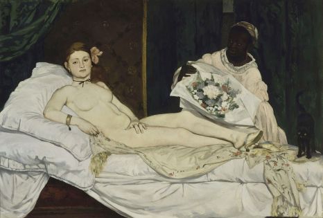
It only made sense then, in his This is Your Life (but okay, mostly mine) painting, Manet would include his own Olympia on the back wall.
But with a difference.
She is no longer glaring back at us, but rather, gazing adoringly at her hero, Zola.
Zola’s Sumo Angel
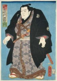
After 200 years of seclusion, in 1850, Japan had opened its doors and the result was a fascination with Japan and its Arts. The fascination, called Japonisme was shared by Zola, Manet and apparent in the works of their contemporaries.Short of dressing his friend in a kimono, Manet will take every opportunity to add an Eastern touch to the painting, including a glimpse of a Japanese screen on the painting’s edge and a Japanese print on the bulletin board.
In the print, a wrestler by Utagawa Kuniaki II watches over Zola.
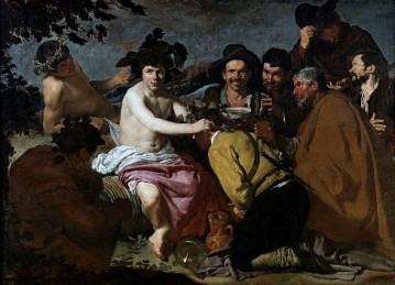
Further conveying the two men’s tastes in art, we spot a reproduction of the Spanish painter, Diego Velazquez’s bawdy The Feast of Bacchus (also known as “The Drinkers”).
Sealing the Bromance
Zola was not in love with Manet’s portrait and hid it away in an antechamber of his home.
Who knows?
Maybe he found the stare too empty and the bulletin board too full.
Either way, the portrait sealed a friendship and left a bond that would last far beyond a writer’s cluttered walls.
Jean Cauthen is a Painter and fake Art Historian. She has a studio in Mint Hill, NC and teaches Arts and Culture classes at UNCC. Her painting workshops in Ireland include a “Guinness and Art History” where she asks that participants keep any discrepancies to themselves and focus on the Guinness. Join her in May 2017!
This is our last post for 2016. Watch for our new series, Third Degree starting in 2017. Happy Holidays and thanks for following us.
We are the only online art contest where you
compete at your skill level.
Monthly cash prizes are $500, $250, $100 plus other prizes! Our December judge is John Wentz. John was the Master Class Winner for the April 2016 Art Muse Contest.
Click here to enter.
![]()


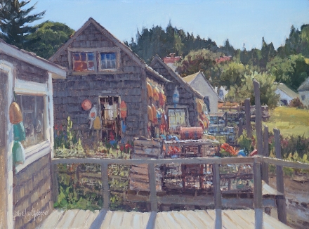

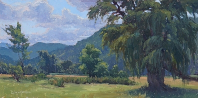


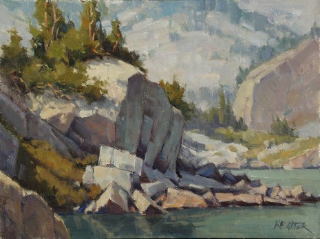
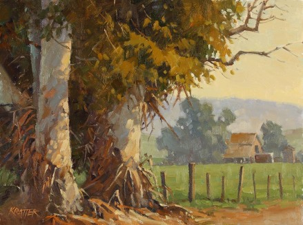
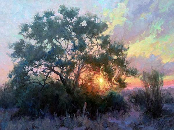
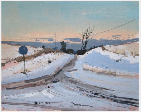
 To learn more about Paul Kratter visit his website by


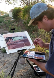
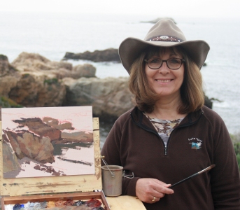
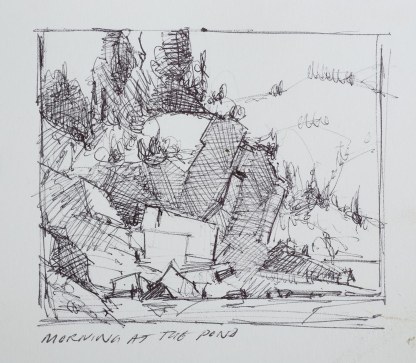
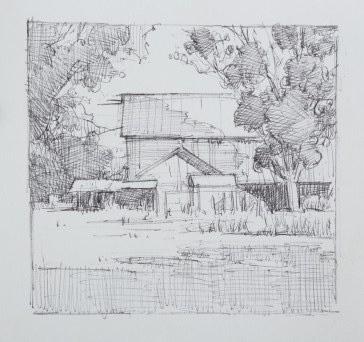
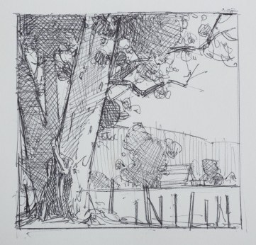
 Also consider timed exercises. Painting en plein air is terrific training for getting an idea down quickly and developing a short term visual memory. Even when working from a static reference it is a good project to set strict time limits to train yourself to get a complete idea down quickly and with minimum fuss.
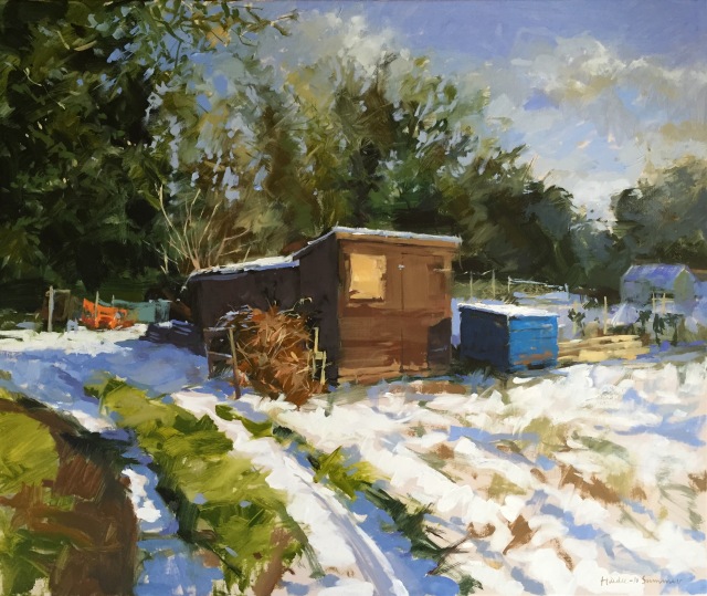
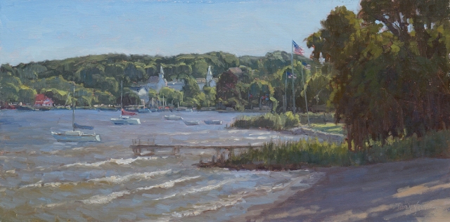
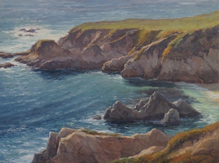
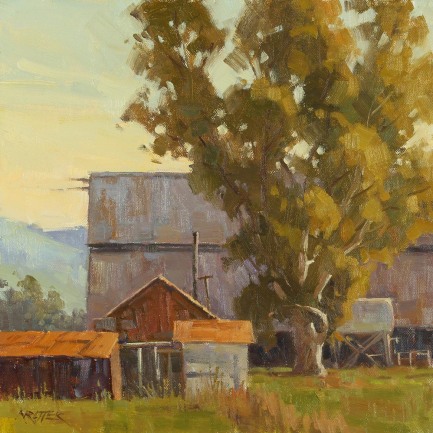
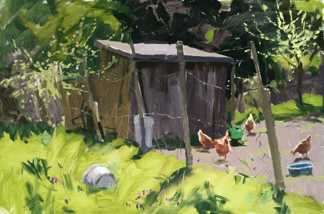
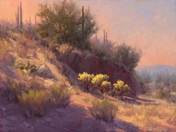
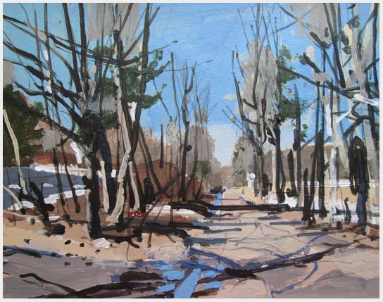
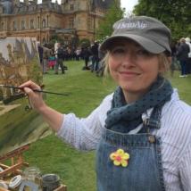 To learn more about Haidee-Jo Summers, visit her


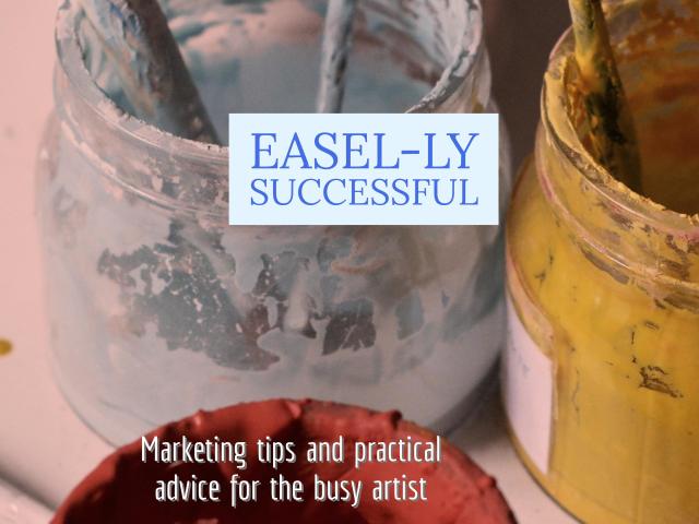 Besides being a painter, teacher, co-creater of Art Muse Contest, assistant to a successful artist, I’m also the Artist BFF. And I’m adding a new blog, Easel-ly Successful, Marketing Tips and Practical Advice for the Busy Artist.
 So, are you going to join me and take the 15 Minute weekly challenge? These 15 minute challenges can help cross off lots of items on your To Do list or ones you didn’t even realize should be on your To Do List. Remember at the end of day, it’s your business and no one will work harder for your success than you!


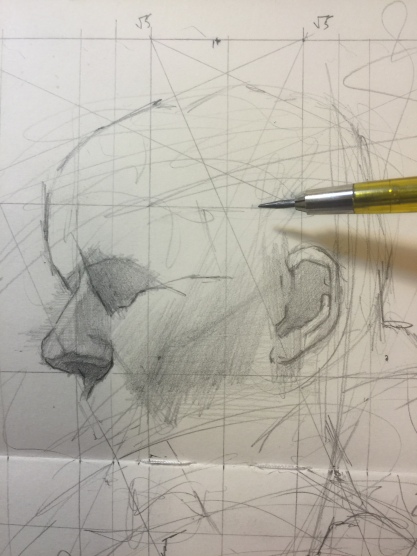
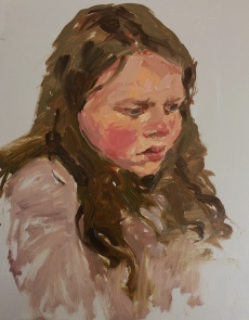
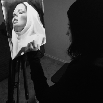
 First, I tone my surface. Darkening the initial stark white of the canvas makes it easier to gauge values. I usually tone my canvas with a grayed version of the scene’s overall, average color. Using a flat brush with a fine edge, I draw with thin, precise lines. A general outline of the head establishes its size and placement. A line down the center of the face helps capture any tilt and/or rotation of the head. Perpendicular to this line, three lines can be drawn to place the center of the eyes, the base of the nose, and the mouth opening. Remembering a few general rules of proportion can greatly assist the drawing.
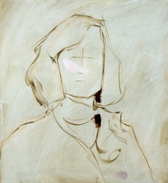 Capturing the effects of light and creating the illusion of 3-dimensionality begins with value. Painters must carefully analyze the relationships between the values in the subject, or else risk the painting looking “flat.”
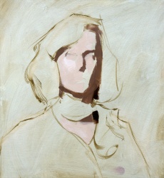 It’s easy to become overwhelmed by the vast array of values visible to our eyes. That’s why it is essential to simplify the subject’s values, especially in the beginning stages. At this time, I paint two more values–one average value for the lit side of the model’s face and one average value for the shadowed side. To mix these values accurately, I study them with my eyelids halfway closed. Squinting like this makes comparing values easier. While squinting, I look at the lit side of the model’s face and ask myself, “How much darker is this value than the very lightest value?” I look at the shadowed side of the face and ask, “How much lighter is this value than the very darkest value?” I compare the lit side to the shadowed side in the same way. I mix one average value for the lit side of the face and one average value for the shadowed side, then paint these two values as large, general shapes.
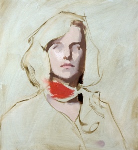 Next, I block in the “halftones” or “midtones”–the values that occur between the lit and shadowed regions. I maintain accuracy by continuing to squint and compare. It’s a good habit to paint the most intense or saturated color at an early point. Much like I use the very darkest and lightest values to determine other values, I use the most intense color to measure other colors. When mixing a new color, I ask questions like “How much grayer is this color than the most intense color?”
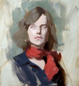 Just as I “blocked in” the face, I now simplify the other elements into two values for each–one value for the lit side, and one value for the shadowed side. Still squinting, I compare each new value to ones I’ve established previously. As I mix each new value, I ask myself, “Is this value lighter or darker than one I’ve already painted?” Then, I ask “HOW MUCH lighter or darker?” Asking and answering these questions helps establish correct value relationships, which in turn enables the convincing portrayal of light and 3-dimensionality.
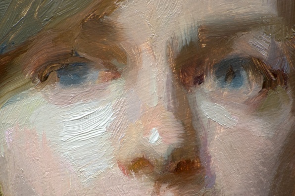
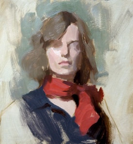 Once I’ve laid a foundation of broad, general value shapes, I start building on top with progressively smaller and more specific shapes. For each new shape, I squint and compare. If you squint at this image, you’ll notice that the large initial regions of light and shadow are still evident. Even though I now add value variations within these regions, I strive to carefully keep these variations properly subtle and closely related to the general value families I’ve established. To keep from pushing these subtle value variations too far, I remember that within each object, no value in the lit side can be as dark as any value in the shadowed side. Conversely, no value in the shadowed side can be as light as any value in the lit side.
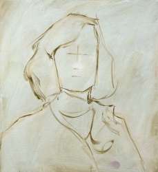
 Once the basic shapes and values of the eye sockets are in place, I begin painting the smaller, more specific shapes on top. At this point, time has run out for the life painting session, but I will complete the portrait later using a photo.
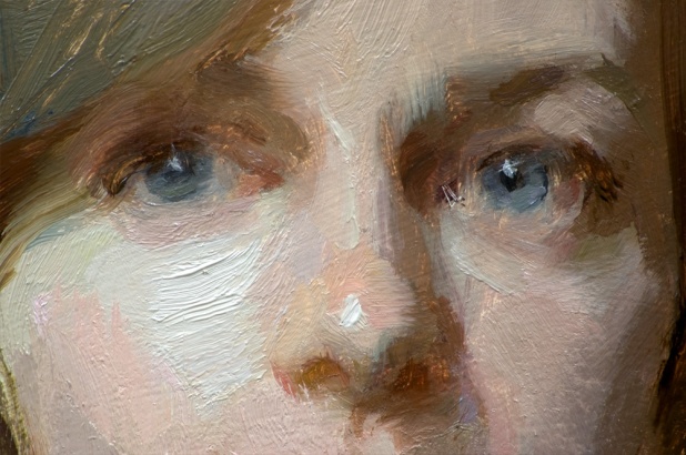
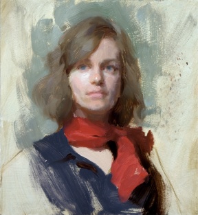 The block-in stage helps to properly understand the subject’s forms in a simplified fashion, as though the forms were composed of a mosaic of angled planes or facets. However, now it’s time to consider the edges between these planes. An abrupt angle change between planes will yield a harder edge. A gradual, rounded transition between planes will yield a softer edge. A “lost edge” occurs when the boundary between two shapes is indiscernible. To avoid my painting looking labored, I strive to paint edges with as few strokes as possible. I create softer edges in two main ways– 1) by dragging one shape into another with a clean, dry brush or 2) by adding a shape of intermediate value between two other value shapes.
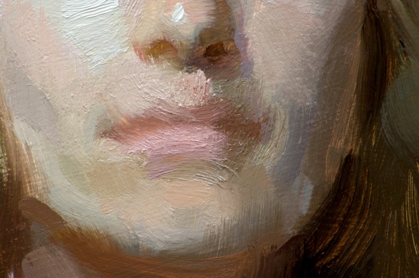 Here is a close-up of the mouth in the block-in stage.
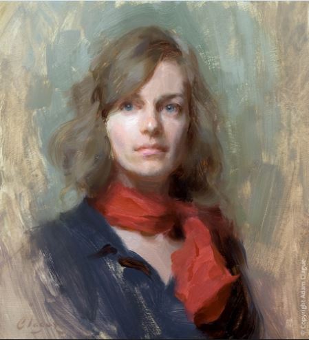
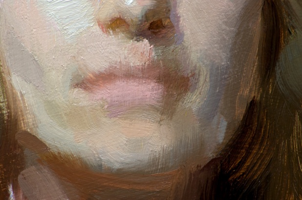


 Jean Cauthen is a Painter and fake Art Historian. She has a studio in Mint Hill, NC and teaches Arts and Culture classes at UNCC. Her painting workshops in Italy always include a “Gelato and Art History” tour of Florence, Italy where she asks that participants keep any discrepancies to themselves and focus on the gelato.


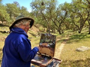
 Visit the sites listed below to learn more about Harry and his work.