Featured

Ask the Expert…Ned Mueller

Question: Are value studies really worth the extra effort?

Answer: It never hurts to work out your design as early as possible.

Just turning 76 and being marginalized with some frustrating physical issues I have just so many “great” paintings left in me and as a result I have been increasing my process of doing more value and color studies. I will mostly discuss doing the value studies as the color studies get more complicated and we only have so much time and space here to discuss things.

As an Illustration major in art school we were trained to do multiple value and color studies, comps as we called them, to work out design or composition ideas before doing a finished Illustration. They helped clarify our ideas and design and enabled us to make sure we were on the same page as the Art Director in charge of the project. I found this process to be incredibly helpful when I got into the Fine Arts and was faced with multiple choices of what I wanted to paint and get some successful results. When I am Plein Air painting I will do quick little idea/value studies to get some design ideas down on paper and especially when I am working in the studio with a more complicated landscape or multiple figure composition.

Value study 1. Color study 1.

My failure rate goes down with this process and although it is not always foolproof, I seem to end up with a lot fewer clunkers when I do a study or two..it helps me sort out confusing areas and to get a more unified painting. I use to do the value studies in oil and sometimes still do, but now am doing them mostly in conte as it is more manageable, quicker and easier to do right on the spot. Every other month or so I will take a batch of photos and do around 20 or 25 conte value studies and then pick out the best 10 of those that I feel good about, then do oil color studies of those ideas. Lastly, I pick out the best 5 or 6 of those to take on to finished paintings.

Value study 2. Color study 2. Value study 3. Color study 3.

By the time that I have gone through this process I am pretty confident that I have worked out most of the major design and color issues and am not faced with as much doubt about what will work best. That is not to say that I don’t also dive right into a canvas and let things happen as they may without doing all of this preparation – I come up with some pretty satisfying results and am convinced that there does not need to be some formula that works for me or anyone else at all times. I do find when I am doing complicated multiple figure compositions of 5 to 25 figures I need organize it with more preliminary studies to get it to where I feel that it works well. In my teaching, in general I find most students doing value or color studies usually get caught up with detail and that defeats the purpose of doing the study in order to work out the values and shapes that make up the design. It is dependent on getting an interesting arrangement of values (darks, midtones and lights), shapes and edges for a value study and for a color study an interesting arrangement of colors (which includes values), shapes and edges.

Value study 4. Color study 4.

We need to ask ourselves questions as we work these studies out and try and remember that usually balance in art means unbalance. A good example being a large dark tree will be balanced by a small dark tree – equals become boring and so on. One usually would like to have your picture more dominant with darks, or with midtones or with lights. More dominant midtones would be balance by a smaller group of darks and so on. We usually see too much, so generally work from bigger value and shape relationships to smaller.

Value study 5. Color study 5.

As we usually see too much squint down to try and see the larger value and shape relationships and not the detail and minor accents at the start Try and think in shapes and not in line. It sometimes helps to define shapes with a line but it is the massing and relationship of values and shapes that are important. Do I have a nice arrangement of large, medium and small shapes and values, some busy, busier and quiet areas to enhance the picture?


Value study 6. Color study 6.

Do I use dark and light shapes and similar colors to move my eye around the picture and sharper, softer and darker and lighter edges to help lead my eye to where I want to viewer to go?  Am I using shapes of different color, but similar values to form more interesting or dominant shapes, and the same with lights and midtone? Can I change a shirt value and color, add a bush, a group of rocks, or take out things that will make the picture more compelling or beautiful?


Value study 7. Color study 7.

It really helps to be familiar with the subject so we can add or subtract things that can enhance or hinder the picture. Use  imagination and ideas that will make it more of our unique voice. I hope this helps you with creating studies They don’t have to take long. They are usually quite fun and often better than our more “finished” paintings. The color studies take a bit longer but can really give a heads up on resolving a lot of major color relationships and issues early on.

Visit Ned’s website to learn more about him and wonderful work.


adobe-spark3

Only 2 months remain to be eligible to win 6 months of gallery representation and be part of the Art Muse Contest winners gallery show at Jack Meier Gallery in Houston Texas!*

*(Emerging Artist and Master Class entrants only. See contest rules for more info.)

Plus we award cash prizes of $500, $250 and $100 every month and so much more.

We are the only online contest where you compete at your skill level against a small number of artists. You won’t find odds like this anywhere else!

Don’t delay, enter today!

CLICK HERE TO ENTER

AMC 7

Ask the Expert…David Grossmann

Question: How do I simplify my painting and not get distracted trying to include every detail I see?

Answer: Hold on to that initial spark.


In Open Winter Spaces, 40x30 inches, Oil on Linen Panel, small
In Open Winter Spaces


My friends and family have been swept into the recent fad of tidying. They are tidying their clothing, their freezers, their toy car collections. By tidying, mostly they mean eliminating. They are slowly purging through their possessions, asking each object as they go, “Do you bring me joy?” Often, the answer is no, so out goes that shirt, that frozen meatloaf, that broken plastic car.

I am sort of like that when I compose my paintings. I wander through the landscape until something strikes me, something catches my attention and brings a spark of what I might call joy. Much of the remaining process is about holding on to that initial spark. Anything that detracts from the feeling that I hope to convey gets eliminated.


sketches 2
Sketches for “Aspen and Shadows on Bright Snow”

Once I know clearly what I want the painting to be about, I do several pencil sketches to finalize my composition. The concept and the composition are what will make or break the painting, so it is better to invest the time into really understanding what I am aiming for than to launch haphazardly into a vague idea.


My sketches are just enough to cement an idea in my mind. They are scrawled, like my handwriting, and usually illegible to anyone besides myself. I first draw a rectangle, then inside the rectangle I arrange and rearrange the main elements of my composition until I feel my idea is visually interesting. Usually I break down a scene into three to five elements, and when I arrange these elements I play a game with myself…the rules of this game are that no spaces should be the same, no shapes should have the same volume, and each value should be distinct.

Aspen and Shadows on Bright Snow, 7x12 inches, Oil on Linen Panel, small
Aspen and Shadows on Bright Snow

This process helps me be more objective about what I am composing; many times after sketching for a while I decide that whatever struck me initially about the scene does not translate well into a composition. Then I move on until I hopefully find something else that does translate well.


October Undertow, 18x24 inches, Oil on Linen Panel, small
October Undertow

All of this so far has been about my process working outdoors. My studio paintings unfold in a similar way and are often based on the smaller paintings I have completed on location. Usually I combine thoughts from several of these small paintings when I am shaping ideas for my larger compositions.


I think of my paintings as visual poems, and much of that has to do with simplifying, pairing down an image to its essence so as to best convey emotion and to allow viewers to step into it with their imaginations unfurled. A beautifully, thoughtfully composed poem carries depth and life in ways that abundantly descriptive prose cannot; we are built to love elements of mystery that draw us beyond what we can see or describe. Brevity often allows the space that our imaginations need in order to step in and engage.

The idea of simplicity has become central not only in my approach to art, but also to the rest of life. Some of the most influential advice I have received was from one of my mentors, Jay Moore, when he told me to live simply and focus on relationships. Simplifying creates space for the pursuit of what makes life meaningful and fills us with that spark of joy.

davidgrossmannpaintingTo learn more about David and see his portfolio of work CLICK HERE.


Banner Ad For AMC

Click here to enter today!

Featured

Ask the Expert…Gone Paintin’

Ask the Expert is hanging up the “Go Painting, Fishing, whatever sign” for the next 3 weeks. We will re-post some of our favorite guests.

Adobe Spark (1)

Today, it’s Terry Miura’s post on “Anatomy of a Landscape Painting”.  An impactful post with great information.

Click here if you missed the post the first time around or just needing a few reminders, it’s well worth the read.

CLICK HERE to enter Art Muse Contest for your chance to win cash and gallery representation!

Ask the Expert…Terry Miura

Question: Could you break down the elements for creating a successful landscape?

Answer:  

Anatomy of a Landscape Painting

I’d like to do a little analysis on some conscious decisions that I made along the way on a recent landscape painting that I did. The ideas I’m sharing may not be new to you, but hopefully they will serve as a reminder to be mindful of the “basics” no matter whether you’re a beginner or a much more experienced painter.

Back on the Road, 18x36 inches, oil on linen
Back on the Road, 18×36 inches, oil on linen

The painting, Back on the Road, is a studio piece, and it is entirely invented. I have done similar scenes on location so I had a very clear idea of the kind of mood I wanted and what I needed to do to achieve it.

Composition

The design is not particularly innovative or unique. I have the horizon splitting the canvas near the middle, a road taking the viewer into the picture, the big tree just off center. These are all common design elements and would be pretty boring if we didn’t do something to alleviate the predictability.

You’ve all heard this good advice; “Don’t put the horizon right in the middle.” Why not? because it’s boring to have the canvas split in two equal halves. I agree. So why not just make them unequal by giving a lot more visual weight to one half. Sure the horizon may go right across the middle, but  all the dark masses, textures, colors, brush activity, perspective, man-made objects are on one half, and the sky as the other half serves as a big passive area, with a more subdued range of values, colors, etc.  That makes the two halves not equal.  Far from it. If you make sure that the visual impact of the two halves are unequal, having the horizon right across the middle is a non-issue, in my book.

The road leading the viewer into the picture is a common device, too. In order to make it more interesting, I  made road curve and also go up and down small hills. Every time the road turns or the incline changes, I had to plot a new vanishing point. So the road alone has at least five–may be six–vanishing points. Tedious? Yes. Basic? Yes. Worth the effort? Yes!

Focal Point

The big tree is near the center, but just a little off to the right. That is a very basic design decision. However, I don’t think there’s anything inherently wrong with having your focal point in the center, as long as it looks absolutely intentional and not because you forgot to think about it.

Again, how you place the rest of the visual elements to create an interesting arrangement becomes critical.

But don’t forget; just because the focal point can be in the center doesn’t necessarily mean it should be. If moving the focal point off-center allows you to improve the design, and allows you to make your statement more clearly or efficiently, by all means, don’t leave it in the middle!

The lightest part of the sky is behind the big tree to create a greater contrast.

OK, so the big tree is my focal element. I spent a lot of time shaping that thing so that it had a good, strong silhouette.  But a strong shape doesn’t by itself make it a focal point. It needs contrast! I always think in terms of value contrasts first, so I made sure I had unmistakable value contrast at my focal point. You can see the sky behind the dark foliage is lighter than the areas flanking it. In this way, I consciously used maximum value contrast, strong silhouette, (relatively) sharp edges, and selective color (more intense yellows and oranges in this area, only), and detail (the silhouette of the foliage has much smaller shapes and calligraphic interest than any other tree) all to support my main focal point.

Colors in the Sky

There are several distinct, albeit close, value steps in the clouds.

If you take a closer look at the sky, you can see the variations in color and value. From the lightest apricot color behind the big tree, to the shadow colors (5) and (6), there are several steps from lightest to darkest.

Also consciously modulated are the intensity of these variations. I put the highest chroma at (1), and made sure the others didn’t outshine that color.

I pushed the color toward red at (3) and (4). To do this, I added Cadmium Red and Alizarin to the mix. Which makes the color redder, but since these reds are so intense, it was necessary to also knock the saturation down a notch by adding a tiny bit of blue as well.

It does looks like many hues are represented; yellow, yellow orange, orange… all the way to a blueish gray in some of the shadow areas of the clouds. But as you know, colors are relative. What appears violet in this context may surprise you when taken out of context.

Violets in the clouds taken out of context.

The two shadow colors may look violet in the picture, but if I had just mixed red and blue on the palette and stuck it on, it would be completely out of harmony, sticking out like a tuba in a string quartet.

So how do you get these subtle colors? Just as I did with the reddish variations, I mixed a violet (probably made from ultramarine, ivory black, cad red, alizarin and white) into the apricot pile, a tiny amount at a time. I kept checking the value and chroma and fine tuned it until I had what I wanted. Mixing violet into a puddle of peachy color of course gave me a muddy gray, but that’s just what I needed.

So as you can see, there is a pretty good range of colors and values in the sky, and each of these variations are used purposefully, whether to highlight the focal area, or to show that the form has a shadow side, or to provide a transition between light and shadow.

Forms in the Sky

 Using softer edges for form shadows, and sharper edges for cast shadows and lit edges.
Using softer edges for form shadows, and sharper edges for cast shadows and lit edges.

Now let’s look at forms in the sky. Because these cloud masses are dense, the light hitting them reveals forms, much like solid objects. By imagining where the clumps are forming, we can decide where light and shadow patterns go.  Since the light is coming from the right (see the cast shadows of the telephone poles?)  the right side of any “clump” would be lit, and the left side and the bottom of the same cloud mass would be in shadow.

I tried to break up the forms a little bit, to make it more fluffy and organic, but the form principle is intact. As for edges, where you would expect to see a form shadow edge–that is, where the form turns away from the light into the shadow, I used softer edges because there is a transition from light to shadow. This includes forms turning under.

See, it’s not so different from painting simple spheres.

Where the lit edge shows up against a darker cloud, the edges are sharper. However, because we are talking about cloud masses, even the sharper edges aren’t razor sharp; they look sharper just in comparison to the softer turning edges. It’s all relative.

Notice the sharpest edge in the clouds are used near the focal area. Another device to bring the eye there.

Atmosphere

The distant hills are painted in the color of the atmosphere. (They don’t have violet gray grass growing on them)

The distant hills are more or less a darker version of the violet, with a slight increase in the chroma. I’m playing up the atmosphere by completely ignoring the local color here.  The rule is, the more atmospheric effect you have, the less relevant the local color becomes.

Things like hills way in the distance become just variations of the atmosphere because essentially, what we are seeing is the veil created by the particulate matter in the air between us and the hills, lit by the sun and/or the ambient light of the sky. We’re essentially painting the color of the veil, not the hills behind it.

Linear Perspective

So the atmospheric perspective used effectively will create the illusion of depth.  This is very useful in a pure landscape painting where there are no man-made objects to give us linear perspective. But often if you look, you can find elements in a landscape which you can exploit to bring in some linear perspective.

In my painting, I have the road, which is an obvious thing since it’s man-made and we understand it as parallel lines going towards a vanishing point. I also used  things like edges of fields, how telephone poles and trees diminish in size systematically. As this was an invented landscape, things like the edges of fields are made up elements specifically to show linear perspective. The view makes perfect sense without them but including them helps to create a sense of vast distances.

Some obvious and not-so-obvious devices to show linear perspective in a landscape.

Perhaps the least obvious, but just as important, are somewhat random-looking strokes on the ground plane that conform to the linear perspective by pointing to a vanishing point.  Especially when you have a foreground that doesn’t have much in it, it can be difficult to make it look like it’s level ground (or inclined, if that’s what you’re trying to depict).  In some cases, the up and down strokes used to describe grass in the foreground end up making the entire foreground vertical, like a face of a cliff. Strokes that suggest a vanishing point will not only help the ground lie flat, but it will contribute to the sense of depth.

Connecting Shapes

Losing edges between tree masses

We’ve been talking about some of the things that go into creating a more complex, believable visual environment, but not all the tools are about adding complexity. Some are about editing out the unnecessary elements.  Simplifying the design strengthens the impact and one of the most useful tools to move in that direction is to combine shapes by losing edges between them.

In my painting, many of the dark tree masses connect, creating fewer shapes rather than a whole bunch of little tree shapes. Our eye doesn’t have a problem perceiving the trees as we intend them to be, even if the combined mass look more like blobs and strips. The context informs the viewer what these abstract shapes are, so we don’t need to give them unnecessary information by painting each individual tree, branch and leaf.

The shapes being connected don’t necessarily need to be same types of objects, like tree and another tree; you can connect tree and grass, grass and barn, shadow on the side of the barn to the shadow cast on the ground… any two shapes with similar value can be connected.

Sometimes, the shapes need to be separated, even if they’re similar in value. It all depends on whether losing the edge there strengthens or confuses the image. You want your statement to be clear, but if connecting certain shapes creates a silhouette of a poodle (or whatever) that completely misleads the viewer, then may be you want to avoid that.

OK, that’s about all I wanted to say about this painting. If you are a beginner and found this information overwhelming, let me tell you that I’ve been there, I know, and so has every great painter. They’ve all had to learn the basics, one canvas at a time. It just takes lots of practice. If you practice with awareness of what it is you want to achieve with each painting, you will improve at a much, much quicker pace than if you just mindlessly go through the motions. Hopefully, this post has given you some ideas about strategies in making more effective landscape paintings!

Happy painting~

Terry Miura (1)
To learn more about Terry Miura and his work, please visit his website.

We are honored that Terry will be the judge for our August Art Muse Contest.

Ask the Expert…John Lasater IV

Question: How do you approach painting nocturnes and not arrive home with a bad painting?

There are a lot of subjects I’m interested in, but not all of them are easy when it gets down to it, like posing a model, or waking up early for a sunrise. Plein air nocturnes are difficult to get motivated for because it’s at a time of day I’d much rather be sinking into the couch. All of my nocturnes have come with some element of struggle, so that has to be part of the experience for me. It might explain some of the “bad paintings” as you put it.

The start is always the hardest part, but there’s a meditative mood to the night. Once I have a piece going, nocturne painting becomes one of my favorite experiences.

Here are a few of the basics when it comes to setting up and painting a nocturne.

Equipment

Good equipment is obviously important, especially the lighting. I used to clip flexible book lights to my canvas and palette, which was simple and cheap. Recently I’ve upgraded to a Revelite, which distributes the light more evenly. The Revelite also allows you to dim the lights to your pleasure. One warning though: I’ve found you can easily over-illuminate your canvas. A dim light is better, because you can see the value separation more truthfully.

This is Revelite


Color Control
This is the Revelite
Color Control

Because there is typically one main light source in a nocturne scene, you will observe a tonal, or monotone, key. One of the biggest hangups I’ve noticed with beginning nocturne painters is they color their piece as if they were painting a daytime scene. The alternating light sources of sun and blue sky makes a myriad of color vibrations in the daytime that are significantly missing from most nocturne scenes. For this reason, I practice color control, which means, I keep a limited color palette for the scene. Below are some examples.

The first scene, entitled “South and Carroll,” was under complete influence of two or three incandescent streetlights. This gave a very warm, or orange, tone to the whole painting. Instead of pushing any of the cool colors in the sky and shadows, I made sure they were strongly influenced by the warm colors I was mixing into everything else, because the shadows had no significant light source.

"South and Carroll"
South and Carroll

The second scene, called “Elkhorn Avenue,” was strongly influenced by the dusky cool sky light. The colors I chose for the shapes influenced by that light were limited to give it a more monotone effect. Also, knowing that I wanted to emphasize the warm points of light given off by the city, I made sure to grey the cool colors surrounding them.

"Elkhorn Avenue"
Elkhorn Avenue

The third scene, called “Corridor,” has a more divided concept. I was struck by how the brilliant, warm section of town was framed in by its surroundings. To accomplish this piece I literally divided the composition and divided the light sources as well. The diagram shows how you can see a similar temperature and color brought about by the two distinct types of light sources.

"Corridor"
Corridor
Movement

Because of the various isolated points of light in a nocturne, composing is trickier. In the daytime, it’s easier to see compositional shapes connecting with one another, but at night they appear more isolated. Finding a scene with midtone shapes that can connect the lit areas helps.

In the scene below, called “Cellar Door,” I demonstrate the movement of the eye, and how the midtones play a role in directing the eye to the brighter shapes. This is a large painting (24×30) created on location in a basement at a local resort. No photo of the scene would do it justice.

Cellar Door
Cellar Door
Going the extra mile

Beyond the unique considerations that a nocturne requires, I like to take my paintings a step further. One of the exciting things to study at night is the effect of glow around a light source and the colors that vibrate around it.

Oakes Street
Oakes Street

In this painting, “Oakes Street,” I looked carefully into and around the street light and the neon sign. It would be easy to be formulaic as often as I’ve painted things like this, but for this one I took my time. It was my hope that the painting would look like it had an internal light source. I’ve included details of those areas, so you can see the color treatment around the lights.

Detail
Detail
Detail
Detail

Get on out there and give it a try. Don’t worry about the failures. Simplify your colors, get a good composition going and go the extra mile!

We usually do a nocturne a day in my workshops, so check out the schedule.

John lasaterJohn P. Lasater IV developed a love for art working as a designer and illustrator for a division of Hallmark Cards.

John now paints full time, both from his studio in Siloam Springs, Arkansas, and on the road painting “en plein air.” He also teaches national workshops. John’s honors include many Best of Show or First Place awards in national outdoor painting events, an Award of Excellence from the Oil Painters of America national exhibition, Artist in Residency’s, dozens of mentions in art magazines and feature articles in Southwest Art and Plein Air Magazine. He also served as a faculty member for the 2015 Plein Air Convention put on by Plein Air Magazine.

Ask the Expert…Thomas W. Schaller

Question : How do I capture the emotion of a scene successfully?

Editing – And the Power of the Unpainted, Thomas W. Schaller

Often, I like to tease my groups by holding up a blank sheet of watercolor paper, and announcing, “Look! The light is already finished – so you’re nearly done!” Joking aside, there is truth there. More than with any other medium, watercolor uses the surface of the paper to supply all the light evident in the final work. I write and talk often on the topic of watercolor as a “subtractive medium”. What I mean by that is – because of it’s transparency – all colors and tones, all the values needed to establish a successful painting are achieved by quite literally subtracting away from the maximum amount of light provided – the pure white of the untouched paper itself. In the final work, this light is either preserved completely in areas of saved white paper, or allowed to shine through – in varying degrees – the translucent washes of the medium.

And so – as in no other medium – the power of what is not painted in a watercolor is just as potent as the power of what is. Just as musicians sometimes describe music as the “space between the notes”, so too painting in watercolor can be seen as the saved light between tones. This is why I have titled my workshop series “The Architecture of Light”; because as artists, we can design and build our paintings with shapes of sun and of shadow.

Watercolor has a reputation of being an unforgiving and difficult medium with which to work. That may be debatable, but while it is sometimes possible to scrub away, to lift, or even to scrape certain areas of a work in an attempt to regain areas of light that have been lost, there is little substitute for the look of a painting where the areas of light have been designed beforehand and cleanly preserved.
Site Study : New York Public Library - NYC Pencil and Watercolor on Stillman & Birn Beta Series Sketchbook Paper 9x12 inches - 2014 This extremely quick composition/value study was done on site in about 10 minutes. Even if I can’t finish a full work on site, plein-air studies are important to record not only what the basic shapes and elements look like, but more importantly, my first reactions and impressions to a subject. So weeks or months later, when I see a quick site study like this in my sketchbook, I am taken right back to that time and place and I can infuse a studio piece with much of that initial emotional immediacy.
Site Study : New York Public Library – NYC Pencil and Watercolor on Stillman & Birn Beta Series Sketchbook Paper,9×12 inches – 2014. This extremely quick composition/value study was done on site in about 10 minutes. Even if I can’t finish a full work on site, plein-air studies are important to record not only what the basic shapes and elements look like, but more importantly, my first reactions and impressions to a subject. So, weeks or months later, when I see a quick site study like this in my sketchbook, I am taken right back to that time and place and I can infuse a studio piece with much of that initial emotional immediacy.

It is for this reason that I often do – and urge my groups to do – small, very quick value /composition studies before beginning a larger work. These informal little doodles should take no more than a minute or so to complete, but can be invaluable in helping to identify the basic “value road map” that you wish your work to follow.

When doing this final studio painting, I was reminded by my earlier site study to not get too hung up on minute architectural detail - to only show what was essential to tell the story of light. Important here too was the strong and simple arrangement of values - the lightest lights being the pure saved white of the paper.
New York Public Library- NYC Thomas W. Schaller – Watercolor on Saunders Waterford Paper; 140 lb. rough surface, 22×30 inches – 2014. When doing this final studio painting, I was reminded by my earlier site study to not get too hung up on minute architectural detail – to only show what was essential to tell the story of light. Important here too are the strong and simple arrangement of values – the lightest lights being the pure saved white of the paper.

If you can identify three basic compositional values– the lights, the darks, and the mid-tones before you begin, the subsequent painting process will unfold so much more organically and with a great deal more immediacy.

By no means am I suggesting that every detail of a final painting could or should be decided upon and planned beforehand. In watercolor – as in any other medium –this is both unrealistic and undesirable. I mean simply that if you have a basic plan of attack – and know essentially what areas of the paper you wish to preserve as the lightest of the lights – you can then paint with so much more abandon and freedom, adjusting as you go knowing that the basic values of your painting – it’s foundation –are in place. Because much as any of us may love color – no color can save a painting if the values are not comfortably composed and executed with strength and conviction.

It’s become more and more my goal as an artist to “think less and feel more” as I paint. So for me, it’s a good idea to try to get my thinking out of the way before I begin a painting. This way, as I paint, I can truly become lost in the emotive world of the process. And as much as possible, I can thus eliminate anything tentative, indecisive, or half-heartedness in my work.

I’m often asked to describe the “style” in which I work. It’s a fair enough question, but it hasn’t a very clear answer. I suppose I would call it a kind of “Interpreted Realism”. I am always asking my groups to try to paint less of what they see and more of how they feel about what they see. For me, this is not an abstract concept or slogan, but what I genuinely try to do. As a visual person (and one who is slightly near-sighted! ) as I move through the world , I tend to see everything in patterns of dark and light.

These abstract patterns are what inspire me the most – far more than any literal “scene” or thing I may be seeing. In fact it is the tension, the dialogue, the conflict and the resolution between opposing forces that most interest me in a painting…light/dark, warm/cool, horizontal/vertical – these “opposites” and many others –are what make a painting able to be a vehicle for emotional impact. So, it is not any specific scene that inspires me and that I try to paint. It is the story of these opposing forces that defines and gives it life – that is what I most try to get down on the painting surface. For me, that is the stuff of art.

Value / Composition Study - Steps of Girona - Spain Graphite on Stillman & Birn Beta Series Sketchbook Paper 12x9 inches - 2015 Though a site sketch of real things in a real place, what I was drawn to here and tried to emphasize, was the compelling and abstract pattern of bright lights and deeply etched darks. I arranged three basic values - light, dark, and mid-tones in a vertical pattern to emphasize the narrative of the work - the upward climb from the cool shadows below into the hot sun of this Spanish city above.
Value / Composition Study – Steps of Girona – Spain,Graphite on Stillman & Birn Beta Series Sketchbook Paper,12×9 inches – 2015. Though a site sketch of real things in a real place, what I was drawn to here and tried to emphasize, were the compelling and abstract pattern of bright lights and deeply etched darks. I arranged three basic values – light, dark and mid-tones in a vertical pattern to emphasize the narrative of the work – the upward climb from the cool shadows below into the hot sun of this Spanish city above.

Before I begin to paint, I have a general plan, – an idea in mind – for the story I wish that painting to tell. Things may change as the painting evolves, but I have a pretty clear idea before I start of formatting : a vertical painting tells a very different story than a horizontal one – composition: value organization and registration : will this painting be dominantly light or dark and how will those shapes of tone be organized ? – and color key: I work almost exclusively in complements -blue/orange, yellow/violet, red/green, etc. All combinations of colors, subtle mid-tones and neutrals can elicit an infinite number of emotional responses in a viewer.

Steps of Girona - Spain Thomas W Schaller - Watercolor Fabriano Artistic Paper, 140 lb. The final studio piece was derived almost in full from my site sketch rather than from reference photos. I followed the lead of the sketch to show only the essential elements in the work - the strong and dynamic range of deep,luminous darks, to the saved white paper of the highest lights. And the sense of warm, reflected sunlight - illuminating even the deep arch and cornice - was suggested by the use of complementary color - primarily in the blue / orange range.
Steps of Girona – Spain, Thomas W Schaller – Watercolor Fabriano Artistic Paper, 140 lb. The final studio piece was derived almost in full from my site sketch rather than from reference photos. I followed the lead of the sketch to show only the essential elements in the work – the strong and dynamic range of deep, luminous darks, to the saved white paper of the highest lights. The sense of warm, reflected sunlight – illuminating even the deep arch and cornice – was suggested by the use of complementary color – primarily in the blue / orange range.

In part -because of this subtractive approach I take to watercolor – I have become more and more interested in the larger idea of editing in my artwork in general. More than ever, I am intent on having my paintings tell their story with no more “extras” than are absolutely necessary. If a single brushstroke is unneeded, it is my hope to know that and to leave it out. When I hear my inner voice begin to mumble that I should do “just one more thing”, it is getting increasingly easier to listen to my painting, to stop painting and call the work done.

In doing so, what I have found is that my paintings can have so much more presence and can tell an even deeper, more poetic and more powerful story. If the artist allows the viewer to become involved in his or her work, you will find that they will “connect the dots” – fill in a good deal of detail with their mind’s eye and with their own imaginations. So, I try very hard to not illustrate what I see, but by the assiduous editing of detail, I can interpret my inspirations and present them as actual reaction, response and emotion.

Composition in Violet Thomas W Schaller - Watercolor on Saunders Waterford Paper; 140 lb. rough surface ,24x18 inches - 2015 Derived primarily from imagination, this painting was inspired by my many visits to the American Great Lakes and specifically the feeling evoked by long waits in the evening for Ferry boats to arrive. Another influence were the sparse - almost minimal - and very powerful nocturnes of Whistler. I used primarily shades of purple , but of course they find more strength when vibrating at a quiet frequency with just a bit of complementary yellow - suggesting the calm of peaceful moonlight reflecting on the still water.
Composition in Violet, Thomas W Schaller – Watercolor on Saunders Waterford Paper; 140 lb. rough surface ,24×18 inches – 2015. Derived primarily from imagination, this painting was inspired by my many visits to the American Great Lakes and specifically the feeling evoked by long waits in the evening for Ferry boats to arrive. Another influence were the sparse – almost minimal – and very powerful nocturnes of Whistler. I used primarily shades of purple , but of course they find more strength when vibrating at a quiet frequency with just a bit of complementary yellow – suggesting the calm of peaceful moonlight reflecting on the still water.

As artists, we all have a unique point of view and our own stories to tell. But if you involve viewers, invite them into your world and encourage them to imagine their own stories, art can become a kind of silent conversation – a communion – between painter and viewer.

thomas schaller


To see more of Thomas’s work, please visit his website.

We are pleased  and honored to announce that Thomas be one of our judges for the 2016 Art Muse Contest.

Ask the Expert…Elizabeth Robbins

Question: What are the key elements in making a strong still life painting?

1: Concept.

It’s important to have a strong concept of what you want to paint before you lay the first brush stroke down. Many people feel that this means that there has to be some inner, deep, meaning to a painting that only a docent can explain to the viewer.

Although this is one concept, it’s not the only one. Many times a painting can be just about a memory that you cherish, a favorite vase, or it can be as simple as your favorite rose is blooming and you want to capture it. Having a strong concept also means planning a strategy for your painting. Do you want to have a very dramatic painting with a dark background and a lot of color or do you want to paint something ethereal and high key. Is this painting going to be a horizontal or a vertical? Do you want a lot of negative space so that the few elements in the painting take on a strong importance or do you want to fill up the space with positive shapes?

Example: painting that has little negative space.  The elements
take up most of the canvas.
Lilacs and Apricots 16_20
Title: Lilacs and Apricots
Example: painting that has more negative area than positive.  This makes the main element have great importance. This painting has a “Z” shape composition.
A Lyrical Line
Title: A Lyrical Line

2. Value

Value is King. Being able to recognize the correct value is a process that is learned by squinting. When I teach, many students judge the shadow value way too light. It’s because we are drawn to the light and when we look at the shadow value with our eyes wide open the light area affects our perception of how dark the shadow is. Squinting diminishes the amount of light that enters our eyes and is transferred to our brain. This enables us to more accurately judge the values.

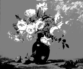
Example: painting with values connected. Notice how the cast shadows of the apples connect to the value of the vase. Notice how the majority of the lights are connected in the upper half of the painting.
Ruby 3 values
Title: Ruby Red, 3 Values
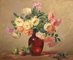
Example: color version of that painting
Ruby Red opa
Title: Ruby Red

3. Temperature

If value is king then temperature is queen and in my opinion just as important as value. Students learn to paint something with a value range but seldom in my experience do teachers explain the important of temperature change. Where there is light, there is temperature change. This is what separates an average painting from an incredible painting. Nature follows laws of light that say when there is a warm light, there will be cool shadows and where there is cool light there will be warm shadows. It is often mistaken that you change planes with a value change when it can be more effective to change plans with a temperature change. I set up most of my still life’s with a 5500K light. This is a cool light, which is considered to approximate the temperature of a North Light window where the blue sky influences the light. When painting outdoors at sunrise or sunset, you will have a very warm light and cool shadows. As students we learn that Yellow, Orange and Red are warm and Blue, Green and Violet are cool. What you need to learn is that a greenish yellow will be warm next to a green but it is cool next to an orange. All colors/value are relative to what they are next too.

Example: warm and cool tones in a painting.

Love at first sight
Title: Love at First Sight

4. Composition and Connectivity

A powerful painting will have a strong connectivity through out the composition.What this means is that there will be a lyrical line that draws you from one element to the next instead of hop skipping and jumping all over the canvas randomly. Just as a music conductor stands before the orchestra telling the musicians where to increase their volume creating a crescendo and when to soften the tone so we listen harder, you are the conductor of this painting. You need to strongly say where an area will be exciting and where an area will be quite. A strong composition will follow shapes such as a “L” “S” “T” “V” and “C”. These shapes can either be drawn backwards, sideways etc to create the line that you want the viewer to follow.

Example: painting with good harmony and “S” shape composition.
Home Grown
Title: Home Grown

5. Shape

We are so accustomed to painting an element by thinking about that element as what it is. Often students paint an eye by thinking of what we think an eye looks like instead of just seeing that eye as shapes of light and dark, warm and cool, organic or abstract. Seeing things in the abstract puts you in the right side of your brain and you’ll be better able to draw the shape more accurately. When setting up my still life I am looking at shapes. I want a variety of shapes from large masses, medium masses and smaller masses. I look at my negative shapes to see that they are interesting and not repetitive. Also look at the positive shapes and determine the same thing. The key to shapes is having variety. Too much repetition is boring and static.

6. Texture and edges

A good still life will have a variety of textures and edges in the paint application. If everything is painted with similar strokes and blended all the same and all your edges are hard then you’ve created monotony. Have areas that are thin and areas that are thicker to create excitement. Great paintings will have a variety of edges. Some will be lost and some will be found. Some will be hard and some will be soft. If you want to draw someone’s attention to a certain area, which will be the focal point, then have more exciting, thicker brushwork and harder edges to that area. If you want an area to be quiet, then have quiet, thin brushwork with softer edges. Again, the key word here is variety.

Example: painting with a variety of edges and an “L” shape composition.
Silver and Cantaloupe
Title: Silver and Cantaloupe

7. Harmony

There should be a harmony throughout your painting, A similarity of color relationships. When you sing a song or play one on a piano, you establish the key in which you will sing or play. We all can hear in a song when someone is off key or a wrong note is played. The same is true for a painting. If you paint most of the painting with all soft high key colors then paint one element that is screaming in intensity, you’ve just painted a sour note. Make a decision in the concept stage what your harmony or key that you will be painting in is going to be.

 Example: painting that has a harmony with intense color.
Sunflowers and Jade
Title: Sunflowers and Jade
Example: harmony with softer colors.
Peonies and Roses 20x24
Title: Peonies and Roses

8. Color

The most often question asked by students is also the most irrelevant. “What color are you using?” Don’t ask yourself what color is it. Ask yourself what value is it? What temperature is it? How bright or dull is it? These are the three questions that constantly go through my mind as I paint. Am I too light or too dark, am I too warm or too cool, and am I too bright or too dull? Whether you paint an orange with a pure orange or with a yellow orange isn’t as important as that you have your value/temperature/intensity relationships correct.

9. Paint what you love.

I can’t over emphasize the important of painting what you know and what you love. I love my flowers. I grow all the flowers I paint. I have a connection to them. I have cared for them and they bloom for me. When I go out to my garden its as if they all shout “Paint me, Paint me!” I can paint a pig if I want to but I’m not really into pigs so when I paint one you can feel the lack of emotional attachment to it. There are many technically perfect paintings out there but they lack emotion. I would rather look at a 100 imperfect paintings where an artist put their heart and soul into the painting than look at 1 perfect unemotional painting. Good art comes from the head; great art comes for the heart.

Liz Headshot cropped

To see more of Elizabeth’s work, please visit her website. We are grateful to have generous artists sharing their experience and knowledge with us. Please visit their websites, facebook, etc. and thank them.